What should this stage produce? Chapter 03 defined responsibilities and API contracts. Now turn those decisions into an interface people can understand, operate, and recover in when something goes wrong.
An agent can build a page quickly. A page that renders does not establish that a task is easy to finish. Use a clickable prototype to check the flow, information order, and interaction states before connecting real services.
We continue the knowledge quiz tool from the previous chapters: provide material, generate practice, answer questions, then inspect explanations and source evidence. The layouts and numbers below are teaching examples, not validated product results.
| Decisions you own | Work an agent can help with |
|---|---|
| What the user does first and which outcome matters | Map the task into views and states; identify gaps |
| Which information is primary or optional | Implement layouts using established styles and components |
| What waiting, failure, and leaving should mean | Create controllable mock scenarios |
| What counts as usable | Check implementation, then validate through actual task trials |
1. Derive Views from Tasks
Start with one task: “Practice using this material, find what I misunderstood, and check the evidence.” Follow that task before listing a homepage, dashboard, or account center.
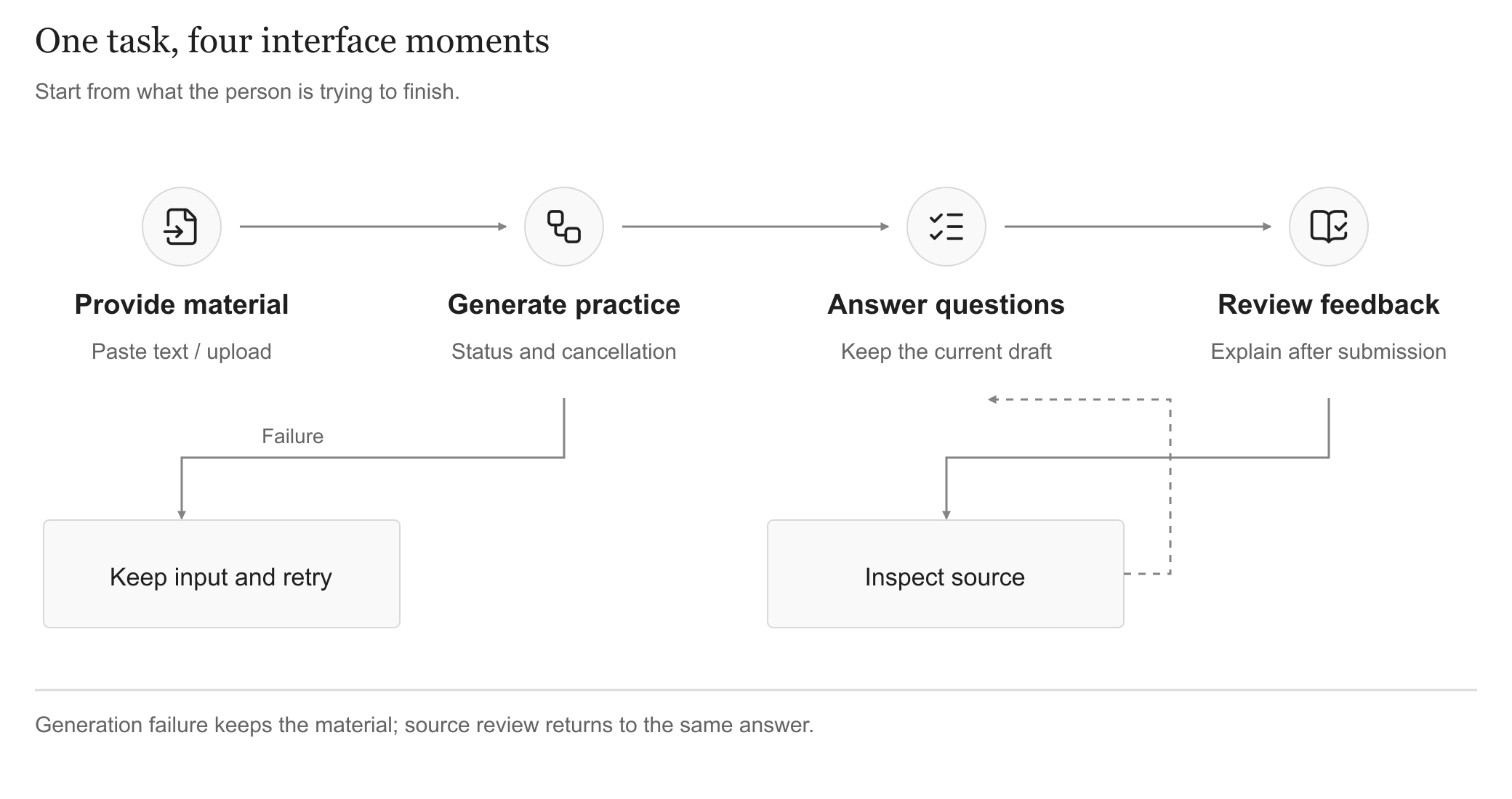
Views follow the task; they need not become four separate URLs. View full-size
Organize around the task; each moment does not need a separate URL. A small tool may switch states on one page. Split views when length or independent access justifies it.
- Provide material: Explain supported inputs and place format or length limits beside the input.
- Generate practice: Keep the input recognizable; explain the wait and offer cancellation or recovery.
- Answer questions: Make the question, answer controls, and submission clear. Do not reveal explanations prematurely.
- Review feedback: Distinguish correct, incorrect, and insufficient evidence. Source review should return to the same answer position.
This list defines the prototype scope. Do not add accounts, history, or billing merely because a template includes them.
Plan the Page Ending
The main content supports the current task. A footer gives the page a clear ending and a place for help, contact details or usage information. Footer.design collects footer examples organized by styles such as grids, typography, illustration and animation. Identify the information groups before considering decoration.
For the quiz tool, a footer could include “Help,” “Report a problem” and “Privacy.” A few links can share one row. With more categories, group help and feedback under support and keep policy information together. Keep “Generate practice,” “Submit answer” and “View source” near the tasks they serve.
You could request: Place a fine divider and footer after the main content, retaining the existing help, feedback and information links. Arrange them horizontally on desktop and let them wrap on mobile. Use descriptive link text and visible keyboard focus, with the footer scrolling in normal document flow.
2. Establish Information Hierarchy
An interface should answer: Where am I? What can I do now? What happens next? Check those questions in a wireframe before refining color, spacing, and decoration.
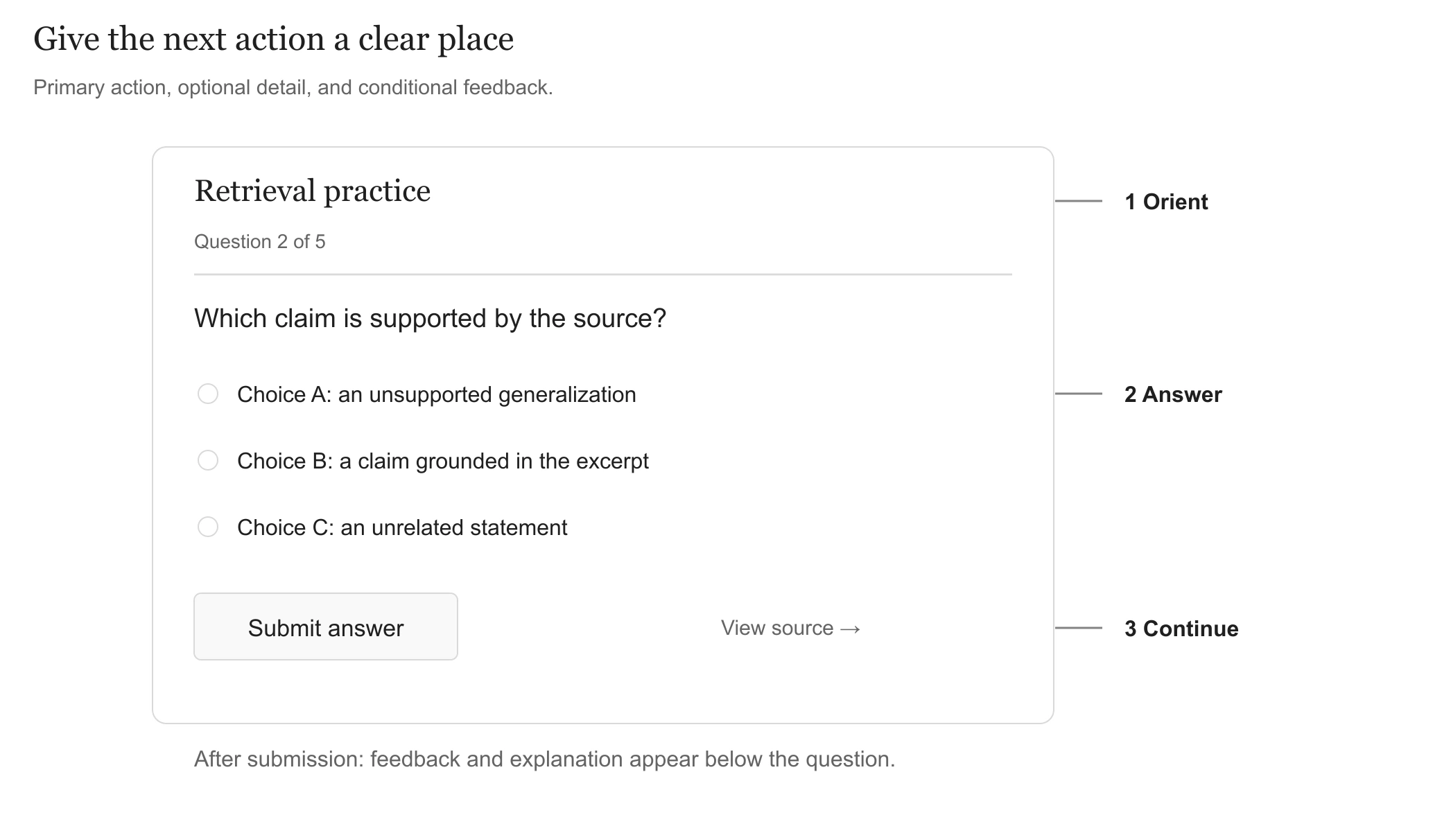
A wireframe for the answering state. Explanations appear after submission. View full-size
Answering is the primary task, so the question and choices lead. Source material is available on demand; feedback appears after submission. Establish this order before making every module an equally prominent card.
Turn references into explicit requirements
Instead of asking an agent to “copy this screenshot,” identify the parts worth borrowing and the existing rules to retain:
- Layout: Is the reference about a split view, content width, or spacing?
- Hierarchy: How do headings, body text, and supporting notes differ? Which action leads?
- Components: Reuse established buttons, fields, navigation, and feedback patterns.
- Boundaries: Design narrow screens, error states, and long content that the reference does not show.
Use an existing component library or the project's current stack. Confirm the task and states before adding dependencies. The GOV.UK guide to making prototypes explains the uses of different fidelities, from paper to code. Choose the fidelity that answers the current question.
Define a Visual Direction
Once the flow is clear, describe the character of the page. Anthropic's frontend aesthetics guide recommends specifying typography, color, motion, and backgrounds, providing concrete references, and identifying generic defaults to avoid.
For our quiz tool, “quiet and suitable for reading” can become this visual brief. These are example decisions; replace them with the rules of your project.
| Design area | A concrete instruction for the agent |
|---|---|
| Typography | Reuse project fonts; distinguish headings, body, and notes. Wrap long questions naturally and choose a readable measure and line height |
| Layout and spacing | Make answering the primary desktop area, with source material available on demand. On mobile, put the question first; group related information and use consistent spacing |
| Color and background | Retain the light background, neutral grays, and fine rules. Make the primary action clear; accompany error and selection colors with text or shape |
| Motion and feedback | Use motion to explain a view change or panel appearing. Keep the answer area stable and show the final state directly when reduced motion is requested |
In an existing product, inherit its design rules first. The guide's font exclusions, dramatic type contrasts, and background effects are example preferences. This site retains its established two-font, neutral-gray direction. Check Chinese glyph coverage, fallback fonts, and mixed-language text separately; an English specimen alone is insufficient.
Extract Rules from References
When a page appeals to you, identify the specific decision worth borrowing. Refero Styles organizes website examples into typography, color, spacing and component rules, with formats such as DESIGN.md. Use its method to turn a visual preference into instructions an agent can reuse.
Observe one decision, write one rule, then define its limits. For the quiz tool:
| What you observe | A requirement for your own project |
|---|---|
| Prominent headings and quieter body text | Reuse project fonts, distinguish heading and body roles, and check wrapping with real long questions |
| Related content sits together, with space between groups | Keep questions and choices together; disclose source evidence on demand instead of importing the reference's entire layout |
| One action leads visually | Prioritize “Generate practice” after material input; keep “Use sample” secondary and specify waiting and failure states |
Keep three things: the reference, the adopted rule, and what still needs validation. Update the project's existing design notes, or maintain a DESIGN.md. The filename matters less than concrete, checkable rules that stay aligned with the implementation.
Refero's example notes distinguish normalized styles, interpreted recommendations and reconstructed examples. Treat these as design references, rather than official brand specifications or original component code. Check the reference's fonts, buttons and palette against your own project before adopting them.
3. Describe the Behavior
“Make it polished” and “add animation” are hard to verify. Beginners do not need to memorize every component name. Start with:
Object → trigger → visible change → completion and boundaries.
Vague: Make the card move.
Specific: On pointer hover, raise the practice card by 4 px over 200 ms and darken its border; restore it on pointer leave. Use an outline for keyboard focus and direct activation on touch. Remove the movement when reduced motion is requested.
The duration and distance are adjustable example parameters. They describe a visual transition, not a promise that a business request finishes in 200 ms.
Turn observations into requirements through see the effect → learn its name → identify adjustable decisions → describe your own requirement. Identify the object on screen, record the wording, position, spacing or state to change, then check the result using your own content.
Describe an Action Entry
“Make the button stand out” leaves its purpose unclear. A call to action (CTA) should explain what to click, what follows, and which action takes priority. CTA.gallery collects buttons, forms, downloads and other action entries. Inspect wording, placement and priority; inclusion in a marketing gallery does not establish conversion performance.
Compare two actions using the same material in the quiz tool:
| Comparison | What to observe |
|---|---|
| Replace “Continue / Try” with “Generate practice / Use sample” | Can someone predict the next step before clicking? |
| Keep explicit wording, then emphasize “Generate practice” | Is the main action easy to find, while the secondary action remains recognizable? |
| Activate the action and inspect waiting and failure | Are duplicate submissions prevented, material retained on failure, and retry clearly available? |
You could request: Make “Generate practice” the main action after the material field, with “Use sample” secondary. During generation, explain the wait and prevent duplicate submissions. On failure, retain the material and offer retry. Check wording, visual priority and request states separately; stronger button color cannot answer every question.
Change One Dimension
The guide also demonstrates typography-only prompts and theme constraints. Here, apply that approach to a bounded iteration: identify the intended improvement, then compare the result.
- Keep a baseline: Capture the same content, state, and viewport before editing, with both desktop and narrow-screen examples.
- Limit the pass: For example, “Adjust only the question page's text hierarchy and paragraph spacing. Retain layout, palette, buttons, and answering behavior.” Keep the scope of a typography change explicit.
- Compare and try: Check hierarchy, long Chinese text, and mobile readability, then complete answering and source review again. Record observations instead of accepting “more polished” as a test result.
Use the lab next to connect these decisions with examples you can operate.
Try the Interface Lab
I built this lab to help newcomers to web design put the interface they have in mind into words. Try the examples and use them to describe what you want for your own project. I'll keep adding styles, animations and fonts, and you can collect designs you like to build a UI inspiration library of your own.
Explore with a Question
Start with Refero Styles, CTA.gallery and Footer.design to understand page rules, primary actions and page endings. Scrolltide and Scroll Shaders are optional advanced resources once the task, content hierarchy and recovery are clear. Choose one question at a time and leave with a requirement in your own words.
| Where you are stuck | Reference | What to take away |
|---|---|---|
| You like a page but cannot describe its style | Refero Styles | Extract typography, color, spacing and component rules into your visual brief or DESIGN.md |
| You need to clarify the next action | CTA.gallery | Specify action wording, position, priority, and waiting and result states |
| You need to decide how a page ends | Footer.design | List retained links and groups, with desktop and mobile arrangements |
| You need to describe a scroll effect | Scrolltide | Select one object and specify its trigger, movement, ending, touch behavior and reduced-motion alternative |
| You need to assess an animated background | Scroll Shaders | Compare color, speed and intensity with your text; record readability and a static alternative |
First distinguish the scroll trigger. Scrolltide offers scroll-related templates, components and generation prompts. For one local effect, distinguish “play once on entering the viewport” from “continuously follow scroll progress.” Hold content, layout and color constant, then compare one change at a time.
For example: Fade the explanation region in once when it first enters the viewport; keep it visible when returning. Let body content scroll normally and show it immediately when reduced motion is requested. For continuous scroll effects, also define where the change starts, ends and reverses. Turn observations into these rules before asking an agent to implement them.
Check text readability before choosing a background. Scroll Shaders presents WebGL backgrounds and related components. Overlay your headings and body text while comparing color, speed and intensity. Does text remain readable throughout, does motion keep pulling attention, and does the page still work when the effect stops?
For the quiz tool, keep questions and choices on a static surface. Try motion in an introductory area if atmosphere serves a purpose, with a still image or solid color as an alternative. A working preview does not validate performance on your devices and page; check an actual phone and long content.
Check the design lesson and asset permissions separately. The lab does not embed templates or shaders from these reference sites. Scrolltide's terms and Scroll Shaders' license distinguish finished-project use from resource redistribution. Check the specific permissions before copying code, downloading assets or offering reusable examples. Public references were checked in November 2026; changing catalog counts and prices are not selection criteria here.
4. Reduce Interaction Burden
Fewer clicks and denser screens need to serve the task. Automatic generation may save a click, but uploading private material or incurring charges requires an explanation before the trigger and confirmation where the product rules require it.
For the quiz tool:
- Reduce searching: Keep material, the current question, and progress in predictable places. Show submission feedback nearby.
- Reduce remembering: Preserve the current selection while inspecting the source.
- Reduce guessing: “Submit answer” is clearer than “Continue.” A busy button should communicate its action state.
- Reveal details on demand: Collapse explanations and full material where appropriate, with discoverable entry points.
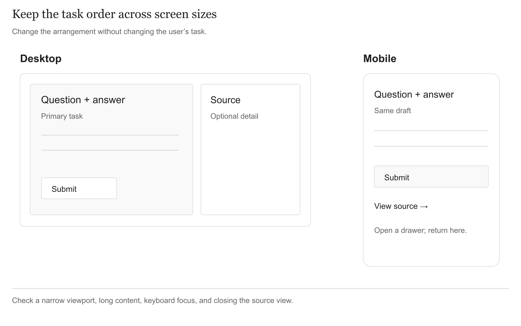
A secondary source panel can move into a drawer; preserve the current answer. View full-size
Desktop may show questions and source side by side. On mobile, prioritize answering and open the source on demand. Responsive design preserves task order; shrinking the desktop is insufficient.
Check these directly
- Keyboard: Reach controls in order, see focus, and return to the opener after dismissing an overlay.
- Touch and narrow screens: Essential actions must not require hover. Controls remain usable without page-wide horizontal scrolling.
- Meaning: Give errors textual explanations. Do not communicate selection or completion through color alone.
- Motion: Respect the system's reduced-motion preference. Status must remain understandable without animation.
These checks relate to WCAG 2.2 requirements for keyboard access, focus, reflow, and status messages; performing a few checks does not establish conformance to the whole standard. Browsers expose the motion preference through prefers-reduced-motion.
5. Design Waiting and Recovery
AI mockups often show only input and an attractive final result. Prototype the intermediate states to discover repeated clicks, premature impressions of completion, and lost material.
| State | What users should understand and be able to do |
|---|---|
| Empty | Know the supported material and next action; optionally try a sample |
| Invalid input | See the reason near the field, with entered content retained |
| Running | See genuinely available status; avoid duplicate submissions |
| Partial output | Know it is unfinished and what remains missing |
| Complete | See the result and next action, beyond a success notification |
| Failed or canceled | Know what is retained, how to retry, and whether another charge applies |
Do not invent progress. If the backend can only confirm “accepted” and “generating,” show those states. Without a basis for total work, do not display a precise-looking percentage. The lab explicitly labels its progress as a local simulation.
Streaming does not establish faster processing. It can reveal output progressively, but measure time to first useful content separately from full completion. Durable queues, background execution, and recovery belong to chapter 08 on production upgrades. Here, define what the person sees and controls.
For example, retain material when quiz generation fails and offer retry. A prototype's Cancel button defines intended behavior; whether the server can stop work and what happens to charges still require contract confirmation.
6. Build a Clickable Prototype
Give the agent the core task, scope, API contracts, existing visual references, and state rules. Use controlled mock data to make the full path testable first.
Attach a behavior description to the relevant component. One applicable description from the lab is more useful than ten unrelated animations in a broad prompt.
Then compare the prototype with chapter 03's contracts: does the data exist, can errors be distinguished, and do cancel and retry have matching meanings? A behavior working with mocks does not mean the real service supports it.
7. Validate with a Task
Walk the full flow yourself, then ask someone resembling the intended user to try it. Give a task without teaching each click. Record hesitation, misunderstood wording, and unnecessary backtracking.
For example: “Use this material to complete a quiz, check the evidence for a wrong answer, and return to your practice.” Observe completion and points needing explanation. Do not claim efficiency gains without measurement.
Bring these into the next stage
- A clickable prototype: One complete task and an accessible failure branch.
- Views and state rules: Who triggers each change, what appears, available actions, and when it ends.
- Component and layout decisions: Reuse, mobile behavior, and draft retention.
- Trial notes and open questions: Observed problems versus items needing real services or users.
Connect real features and data in the next stage. Replace mocks scenario by scenario and verify again. The prototype's central deliverable is a shared, checkable understanding of what should happen.